
EXIT: Mapping Migration and Climate Change
There are more than 19.5 million refugees worldwide, cities are emitting 70% of all greenhouses gases and around 3,500 languages are currently in danger of extinction.
The statistics around the climate change debate may make for increasingly stark reading, but they suffer from one major drawback: that we, as humans, find it difficult to relate to data – no matter how shocking the numbers.
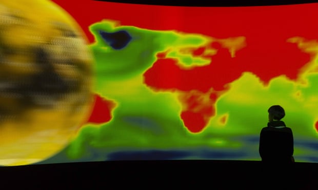
This issue is central to a new exhibition, Exit, being staged at the Palais de Tokyo in Paris. A vast 360-degree video installation, with viewers seated in the middle, Exit will bring to life – through a number of animated maps, visuals and text – all the data that shows the extent of the human and ecological cost of climate change.
The show’s curator, Hervé Chandès, says Exit offers a “new aesthetic for how we can relate to the the destruction of our own planet”.
The staging of Exit will tie in with the COP21 United Nations climate change conference taking place in Paris, which will see world leaders gather in a bid to create an agreement on global warming. By placing the installation within this context, Chandès says, makes it a “call to action”.
Chandès, director of the Fondation Cartier contemporary art museum in Paris, originally commissioned the installation in 2008, at a point when human migration began to take place on an unprecedented scale. The idea was born from a single question posed by the cultural theorist Paul Virilio: “What is left of this world, of our native land, of the history of what so far is the only habitable planet?”
The Fondation brought in New York design studio Diller Scofidio + Renfro to work with climate change scientists, including François Gemenne, to create a work that spanned the disciplines of science and art to bring to life the current state of planet Earth.
The installation shows that, in the years between 2008 and 2015, the global population grew by a billion and the number of refugees increased fivefold.
Elizabeth Diller, director of the design studio that brought the data to life through geocoding, says: “We wanted to tell poignant stories of the drama of uprooting people from their homes without resorting to narrative media, whose familiarity and realism is often desensitising. So we challenged ourselves to use only data – the driest and most abstract information – to create a strong, palpable effect.”
The 45-minute installation displays the stark reality of population shifts and city growth, the global spread of political refugees and forced migration, rising sea levels, natural disasters, deforestation and the death of languages – all drawn from more than 100 different sources of scientific and ecological data.


Recent Comments